Brand / SymbiOp Garden Shop
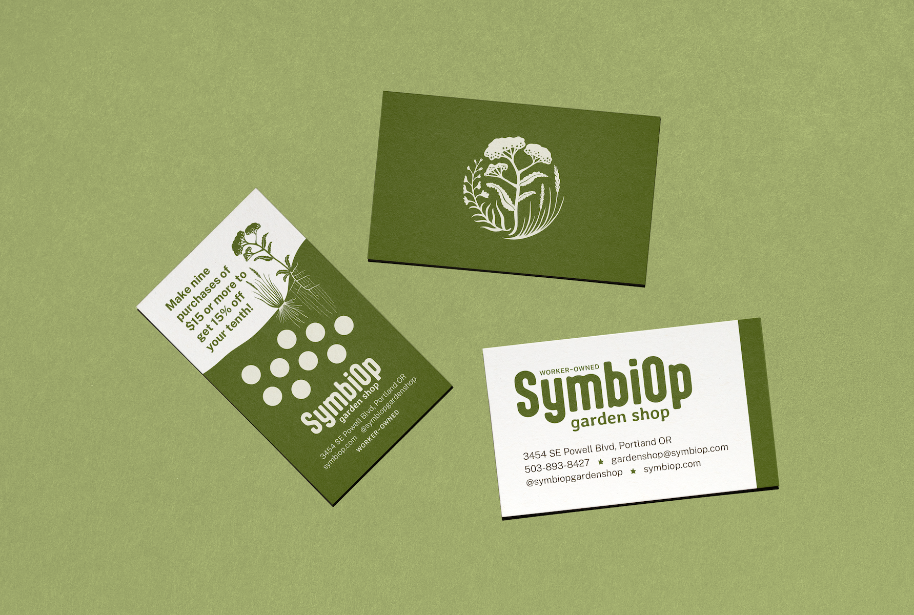
Rebrand, logo design, brand guide, marketing collateral, + creative direction.
Led rebrand for SymbiOp Garden Shop, Portland’s worker-owned garden and gift shop specializing in native plants. Over the course of six months, I pursued a rigorous research and design process to develop the final logo and brand elements, with guidance, feedback, and consensus agreement from 20 worker-owners within the cooperative.
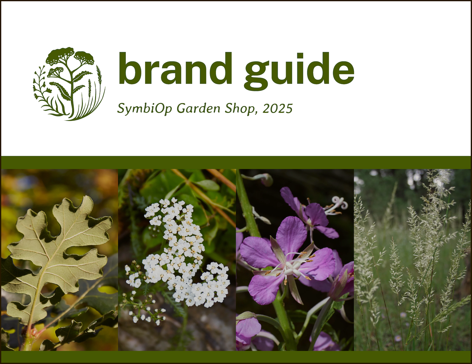
Sample pages of the brand guide I developed for SymbiOp.


The Logomark
In urban settings, native grasses and wildflowers are often overshadowed by ornamental species, preferred for the American garden yet maladapted to so many local native ecosystems.
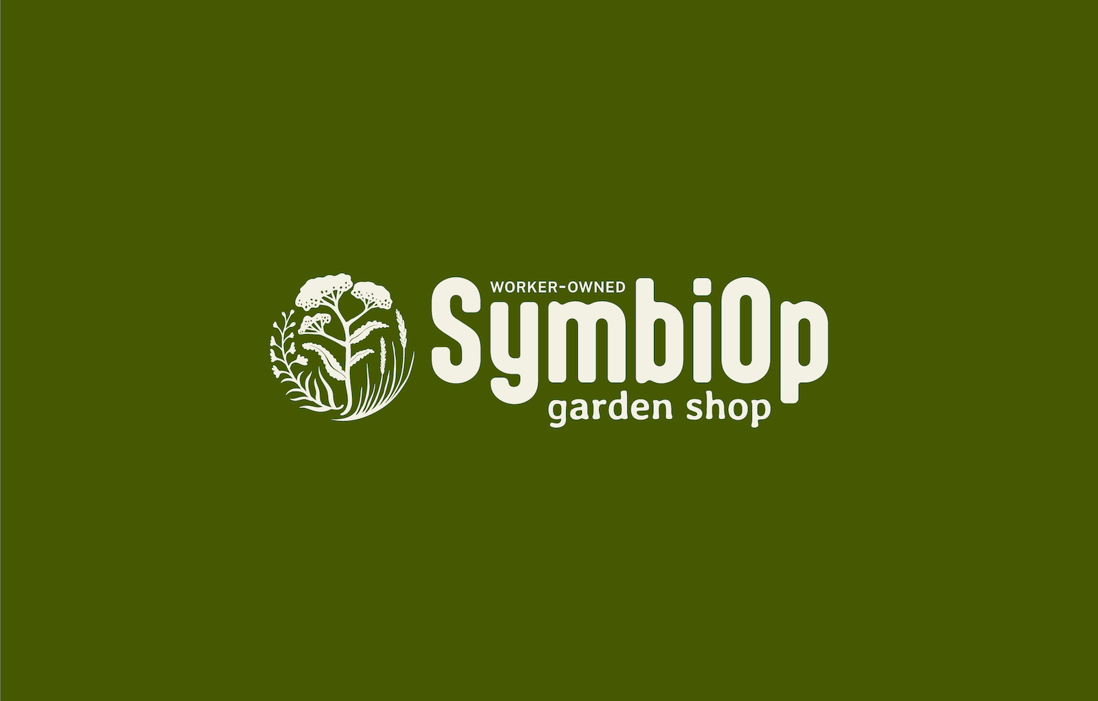
The SymbiOp Logomark “Plant Trio” depicts three under-appreciated yet visually stunning and ecologically supportive native species of the Willamette Valley: Fireweed, Common Yarrow, and Prairie Junegrass. Thriving in disturbed soils and well-adapted to fire and drought, these plants offer solace and medicine, embodying SymbiOp's values of cooperation, reciprocity, and resilience amidst capitalism, colonialism, and climate collapse.
The Logomark’s folk art illustration style brings to the brand a whimsical, handmade touch, referencing hands at work: farming, tending, and creating alongside the plants.
Process and Background
The cooperative approached me to modernize, professionalize, and clarify SymbiOp’s brand to reflect the values and practices of the company and the specificities of the surrounding Willamette Valley ecosystems.
Original logo, in use 2021-2025.
Rebranded logo, launched 2026.
Through many conversations and much input from 20+ worker-owners, I developed the following goals for SymbiOp’s rebrand concept:
Replace the logo’s current sprout imagery with imagery that specifically references the Willamette Valley’s native ecosystems.
Replace brand colors with a palette that reflects natural colors existing in the local ecosystems while following Web Content Accessibility Guidelines (WCAG) international standards for contrast and accessibility.
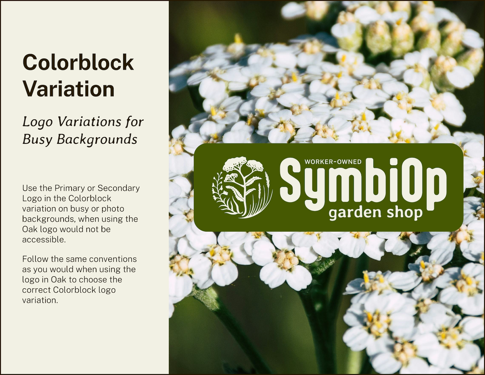
Incorporate SymbiOp Garden Shop’s new tagline, “Worker-Owned,” into the logo while introducing visual references that reflect SymbiOp’s commitments as a cooperative to working class solidarity, fair labor practices, accessibility, and community education.
Develop a clear typographic style that complements the brand’s overall tone and imagery.
Balance a modern and professional look with organic imagery with references to the natural world.